
[Introduction]
Project: Revitalizing Christie’s Email Newsletter for Higher Engagement
I designed and implemented new lifecycle communications using a data-driven approach, led delivery sprints, and trained cross-functional teams on a new drag-and-drop email editor. This work resulted in a significant increase in click-through rate and conversions.
Deliverables:
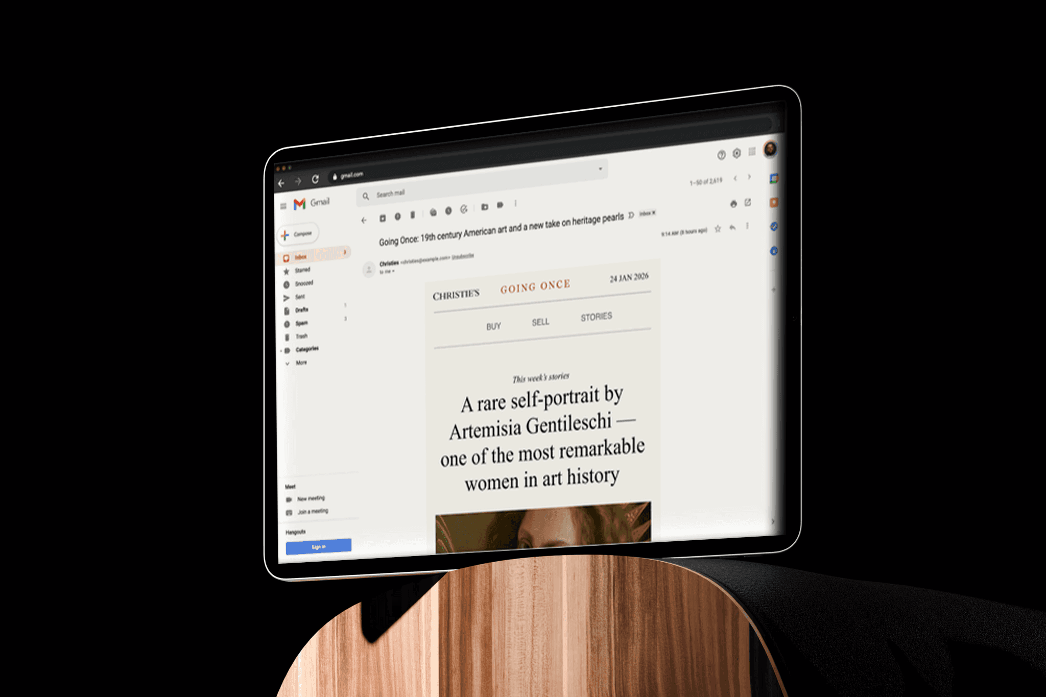
A new editorial email template for Going Once…
An updated personalized email template aligned with the refreshed brand system


[Description]
Project Overview
Client/Brand: Christie's clients
Timeline: 9 months
My Role: UXUI Design, HTML/CSS Development, Strategy
Tools Used: Figma, Adobe XD, HTML/CSS & Braze
The Challenge (The "Before")
The Pain Point: Old template is no longer on brand. The CTR and Open rate is gradually dropping. Responsiveness issue.
Opportunity for redesign: Platform migration
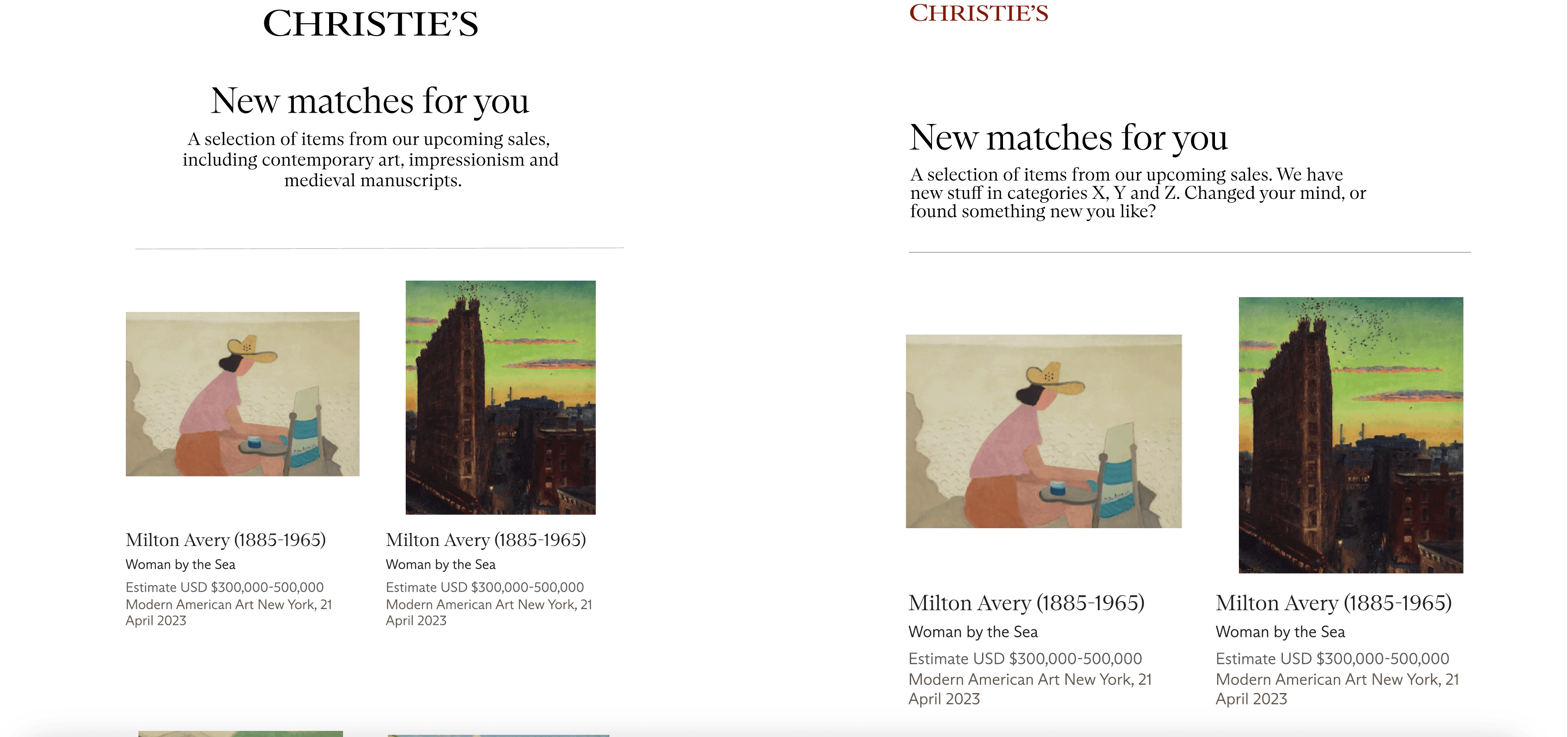
— Christie's leveraged Braze to deliver highly personalized experiences. Using modular, drag-and-drop templates, dynamic content blocks, and Liquid logic, each email could surface relevant auctions, editorial highlights, and recommendations tailored to individual users’ interests and behaviors. This data-driven personalization, combined with timely lifecycle triggers, contributed to a measurable uplift in engagement, including higher click-through rates and increased sign-ups.
Before the redesign…
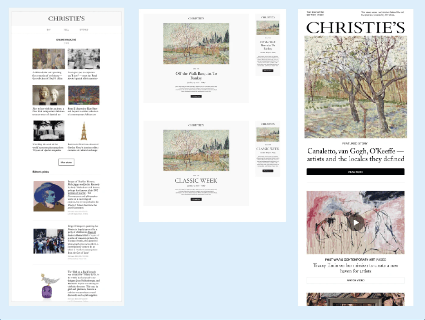
After the redesign:
The Goal & Strategy
Primary Objective: New and refresh look to reflect the brand indendity. Increase CTR, reduce unsubscribe rate, improve accessibility).
The Strategy:
Modular Layout: Creating reusable components to speed up production.
Mobile-First: Prioritizing the mobile experience as 60% of users opened on phones.
Dark Mode Optimization: Ensuring legibility across viewing modes.
The Process
UX research: As a producer, I took the lead to run the visual/heuristic analysis of the current product with internal team and stakeholders. I created a Miro open doc for contributor to add anything relevant to this project document which will continue to evolve as the product does.
Our analysis combines collaborative workshops and evidence-based evaluation to quickly surface key product issues, opportunities, and user goals. We start with group exercises like Thinking Caps to build shared understanding, then assess the experience against established heuristics (e.g., Nielsen Norman principles and broader design theory), accessibility standards, and competitor benchmarks. We layer in qualitative insights from user research, voice-of-customer feedback, reviews, and support data, alongside quantitative analytics to validate patterns and identify friction points. Findings are structured around user entry points, obstacles, and outcomes, highlighting positive and negative heuristics, accessibility issues, bugs, and platform considerations. The process concludes by synthesizing insights into clear problem statements, questions, and “How Might We” opportunities to guide next steps.
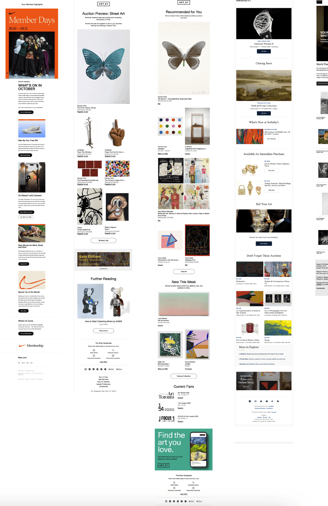
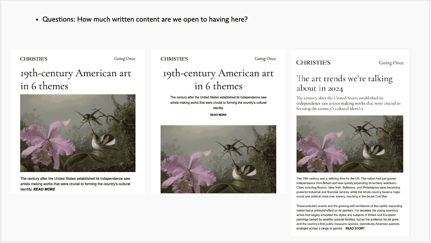
Peer review and inspiration
Wireframes/Sketches:
Wireframe | |
|---|---|
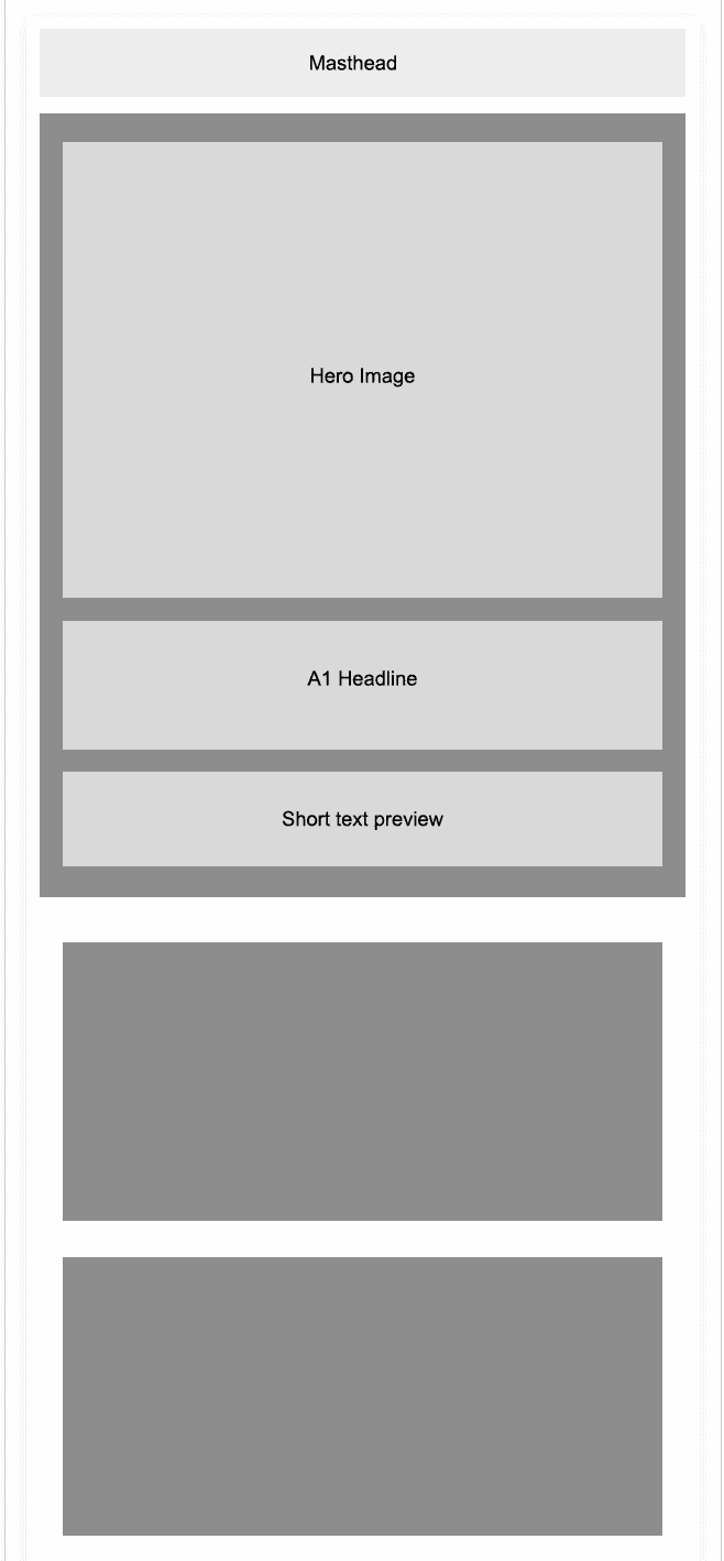 |
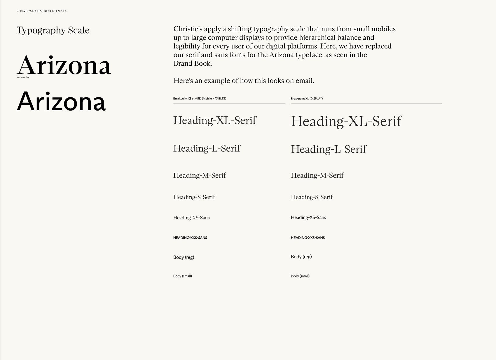
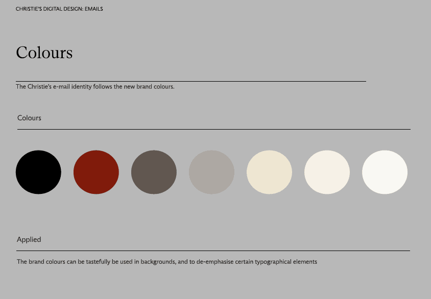
Typography & Color:
Typography analysis and review
Accessibility Checks:
Clear structure and reading order; avoid images for essential content
Readable text (≥14px, good line height, no all-caps blocks)
Sufficient color contrast; links identifiable beyond color alone
Descriptive links and large, tappable buttons
Meaningful alt text for images; decorative images ignored by screen readers
Keyboard and screen-reader friendly navigation
Responsive and readable at 200% zoom on all devices
Proper labels for any inputs or forms
Correct language set and plain, clear copy
Tested with screen readers, contrast tools, and major email clients
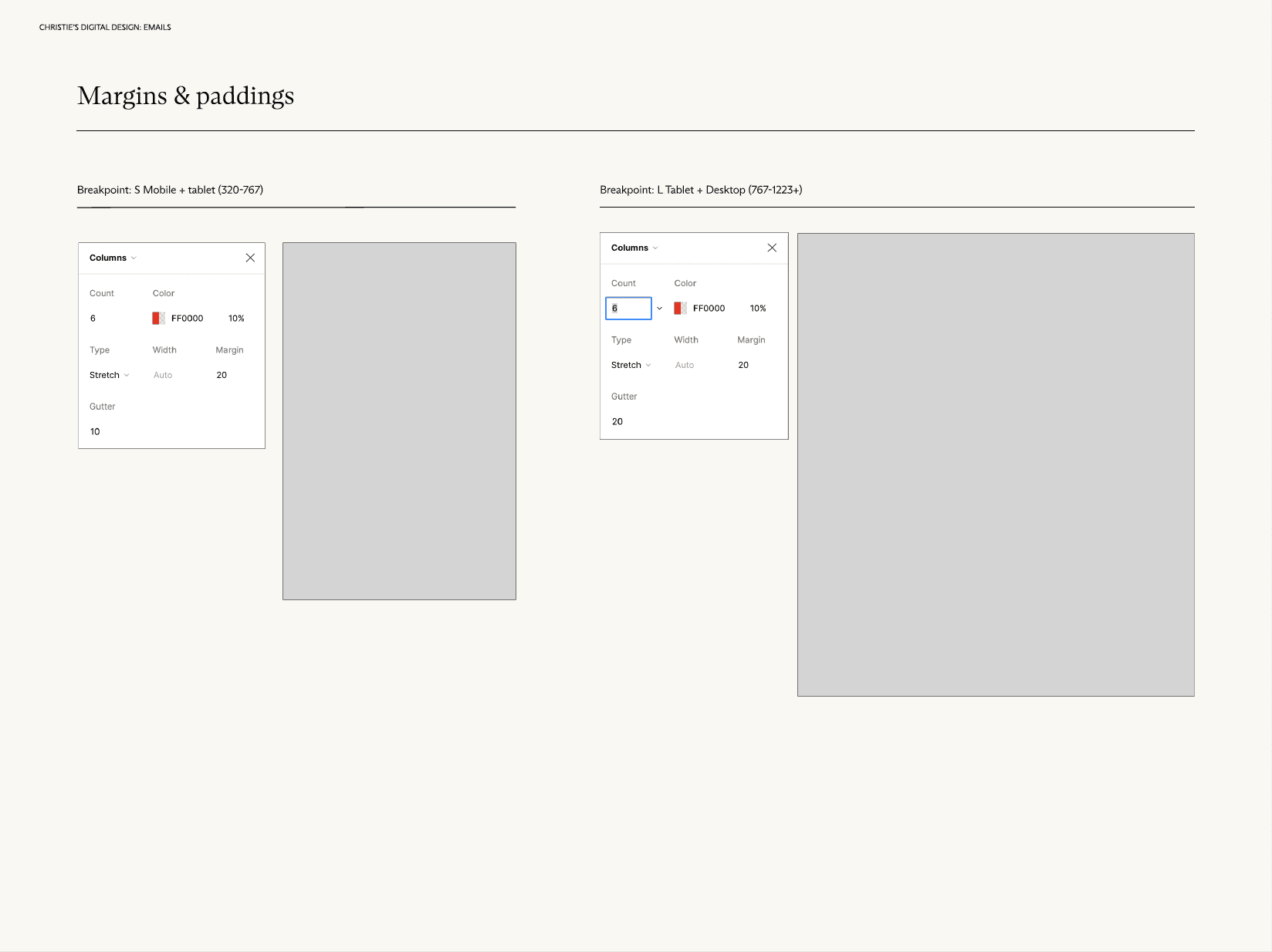
Margin and padding review
The Solution (The "After")
Key Features Callouts:
Optional Event component
Personalization
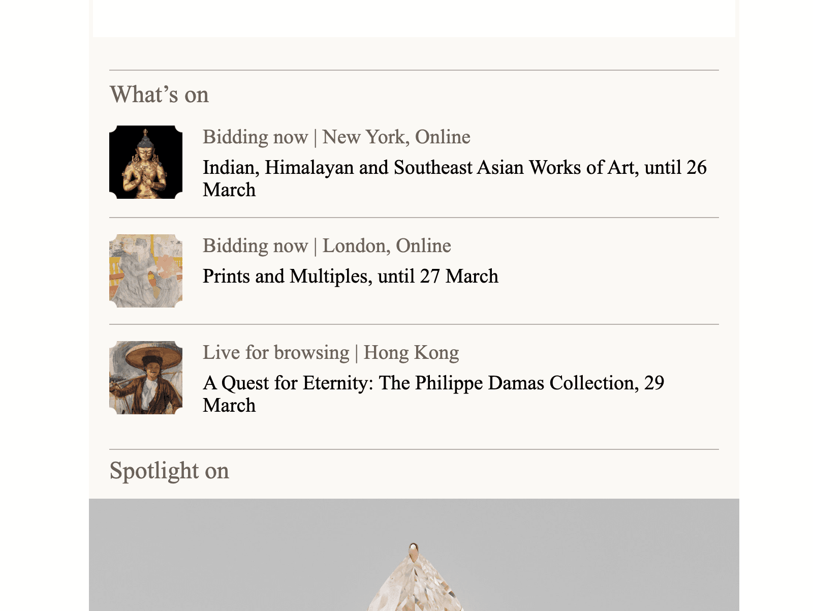
A component-based template that supports drag-and-drop content blocks (such as What’s On and Spotlight On), ideal for campaigns featuring multiple concurrent selling events.
Redesign of the personalized offering section to better surface relevant content
Retrospective
A pilot launch and A/B testing phase demonstrated strong performance, delivering a 10% click-through rate and a 24% year-over-year increase in sign-ups. These results validated the mobile-first, component-based approach and led to the template being scaled as a reusable system for future campaigns, supporting both consistency and continued growth.
How thoughtful email design can drive engagement and conversion within real-world constraints? The project focused on creating responsive, accessible, and brand-consistent email templates that perform across devices, inboxes, and email clients.
Working within the technical limitations of HTML email, I prioritized clear content hierarchy, scannable layouts, and mobile-first design to support how users actually read emails. Each design decision balanced visual storytelling with usability—ensuring key messages, CTAs, and value propositions were immediately clear, even with images blocked or viewed in dark mode.
Beyond visuals, this work emphasized performance and iteration. Designs were informed by audience segmentation, campaign goals, and A/B testing insights, allowing for continuous optimization of layouts, CTA placement, and content prioritization. Accessibility best practices—such as color contrast, semantic structure, and alt text—were embedded throughout to ensure inclusive experiences at scale.
The result was a flexible email system that supported fast production, consistent branding, and measurable improvements in engagement, while strengthening collaboration across design, marketing, and development teams.